

You're holding a fresh box of team caps when the captain lifts one from the tissue paper and pauses. The artwork looked balanced on the screen, but on the finished hat the logo seems half its intended size, the top of the crest disappears into the crown curve, and the lettering near the brim is already losing definition.
That failure usually starts before the needle runs. Golf hat logos live inside a limited front-panel envelope, generally about 4 to 5 inches wide, with a practical embroidery target of roughly 15,000 stitches or fewer according to structured-cap embroidery guidance. Crown height, panel seams, fabric stretch, and brim curvature all change how flat artwork behaves.
The reliable order of operations is simple: prepare the file, choose the decoration method, measure the crown, place the mark, and give the vendor a brief that leaves no production decision to guesswork. That same discipline matters whether you're ordering a club run, a tournament cap, or launching hats with print on demand, where the artwork still has to survive the physical shape of the hat.
Why Golf Hat Logos Are Trickier Than They Look
The front panel is a working surface, not a blank canvas
A structured six-panel cap may look broad from a distance, but the usable embroidery field narrows once you account for the center seam, side seams, crown height, and the curve above the bill. A logo can fit inside the digital artboard and still collide with a seam or buckle across the crown.
The most common mistake is approving the artwork at screen size rather than approving it on the exact hat blank. A clean vector crest can look generous in a design file, then appear compressed when stitched onto a low-profile crown. The thread follows a curved surface, so horizontal lettering may arch, while a tall icon can run into the crown's vertical limit.
Practical rule: Treat the front panel as a measured production field first, and a branding canvas second.
Golf headwear also carries commercial expectations that make these mistakes visible. Logoed hats became a mainstream marketing channel after the 1968 PGA Championship moment commonly associated with Amana marketer Lou King, who reportedly paid tour professionals $50 per tournament to wear company-logo hats, as recounted by Golf.com's history of logoed golf hats. Later PGA Tour guidance cited in 2018 said that, as a guideline, no more than four different sponsor logos should appear on a player's clothing and headwear, a sign of how deliberately the sport manages visible branding.
Why a good logo fails on a cap
Three physical problems cause most disappointing samples:
- Curvature: The crown bends away from the viewer, so the outer edges can appear smaller or less readable.
- Seams: A center seam can split a letter, interrupt a satin fill, or force the mark off its visual axis.
- Brim clearance: A logo placed too low loses its lower detail in shadow and can distort where the crown meets the bill.
A decorator therefore needs more than a PNG and a preferred thread color. They need the hat class, crown profile, finished dimensions, placement, and a digitized file built for that surface. The front field is usually generous enough for a clear primary mark, but not generous enough to preserve every fine detail from a full-size brand identity system.
Golf apparel branding itself developed gradually. Golf Digest's account of logoed golf apparel notes that course logos didn't appear on golf shirts until the 1970s, while Lyle & Scott introduced a dedicated golf clothing range in 1968 with its Golden Eagle emblem, and Original Penguin's golf-shirt identity dates to 1955. The lesson for today's buyer is practical: a logo becomes part of a hat's identity only when the application looks intentional.
Getting Your Artwork File Production Ready
A decorator checks the file in a predictable order. Follow that order before discussing thread, patch material, or placement, and you'll avoid revisions caused by missing fonts or unusable artwork.
Start with the source file
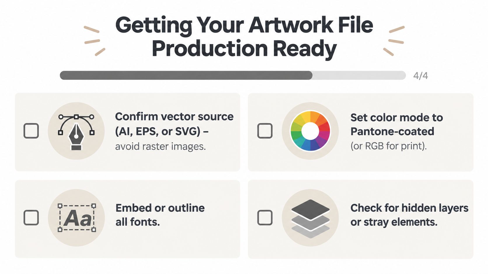
Use a vector master whenever possible, such as AI, EPS, or SVG. Vector artwork lets the decorator resize paths without introducing the soft edges and pixel stair-stepping that appear when a small raster file gets enlarged. A high-resolution raster can still work for printed decoration, but it doesn't give an embroidery digitizer the clean paths needed to assign fills, satin columns, and stitch directions.
Outline or embed every font. A typeface that appears correctly on your computer may substitute when the vendor opens the file, changing letter widths and spacing. Remove hidden layers, stray anchor points, clipping masks, and unused color swatches before export.
Set colors and detail limits
For printed marks, provide Pantone-coated references where the vendor supports them, or use the printer's requested RGB workflow. Embroidery won't reproduce every screen color as a separate thread, so identify the approved thread colors rather than assuming the digital palette will transfer exactly.
For stitched artwork, keep strokes around 0.05 inches or thicker, and avoid letters below roughly 0.25 inches tall, because thinner lines and smaller characters tend to blur or disappear in thread, according to the hat-logo sizing guide from LogoSportswear. Leave clear space around the mark, ideally at least the height of the largest letter, so the design doesn't look trapped against a seam or brim.
Printed logos need their own preparation. Add bleed where the printer requires it, check registration between colors, and keep critical details away from the trim edge. Embroidery needs a digitized DST or EMB file, but the vendor should create or verify that file for the chosen crown profile. Don't assume a flat logo file is production-ready because it opens cleanly.
Name files so the vendor can find the right version
Use a naming pattern such as:
ClubLogo_front_4in_navy-cap_v03_APPROVAL
Include the placement, finished size, hat color, revision, and approval status. If you're testing alternate colorways, a batch logo color change guide can help organize visual variations before you send the final production file. Never leave the vendor guessing which of three similarly named files is current.
Picking the Right Decoration Method
Embroidery remains the default for many golf hat logos because it gives a direct, tactile finish and works especially well on structured fronts. It isn't automatically the right answer. Dense stitching adds weight and can stress lightweight fabric, while a printed or patched application may preserve detail more effectively on a performance crown.
The front field still governs every method. A logo that is too wide can wrap toward the side panels, and an embroidery design that exceeds the practical stitch budget can pucker the fabric. Commercial decorators commonly work within approximately 4.0 inches wide by 2.25 inches high on a standard structured cap, with smaller fields on dad hats and other low-profile crowns, as outlined by Rare Custom's embroidered-hat guidance.
| Method | Best Hat Class | Detail Limit | Cost Tier | Lead Time |
|---|---|---|---|---|
| Embroidery | Structured cotton, twill, and firm rope fronts | Best for bold shapes and readable type, with stitch detail constrained by crown size | Moderate | Moderate |
| Woven patch | Performance or stretch fabrics that don't support dense direct stitching | Fine detail can be cleaner than direct embroidery, but patch edges need room | Moderate to premium | Moderate |
| Leather patch | Structured lifestyle caps and premium country-club styles | Strong for simple debossed or engraved marks, less suitable for tiny multicolor detail | Premium | Longer than standard direct decoration |
| Screen or DTG print | Lightweight fronts and orders needing broad color or photographic artwork | Handles gradients and image detail, but can look less tactile and may wear differently | Entry to moderate | Varies by vendor |
Match the method to the crown
Dense embroidery suits a firm structured crown because the front panel resists distortion. A woven patch can make more sense on a performance fabric that flexes under the needle. Leather creates a substantial, premium impression, but it can feel visually heavy on a thin technical cap.
Print is the flexible option for artwork that depends on gradients, complex imagery, or many colors. It's also useful when breathability and low added weight matter more than a raised surface. For a broader look at how decoration choices affect finished golf headwear, this guide to embroidered golf hats offers useful category context.
A good vendor shouldn't accept your preferred method. Ask for a recommendation if the artwork is too detailed for a compact front field. The right answer may be a simplified embroidery version, a woven patch, or a printed mark that preserves the recognizable parts of the identity without forcing every detail onto the crown.
Measuring and Sizing the Logo for Your Hat
Measure the actual hat blank before approving artwork dimensions. A flat mockup hides the space lost to seams, the brim curve, and the crown's vertical shape. Treat the logo as a production fit first, then make branding decisions within that usable field.
Find the real embroidery field
Confirm the cap style, whether it is structured, mid-profile, low-profile, or unstructured. Open the crown gently and locate the widest practical area across the front panels. Measuring from the outside edge of one side panel to the other exaggerates the room available for a centered logo.
Fold the cap along the two front panel seams and crease a vertical centerline. Use that line as the horizontal reference, then measure upward from the brim seam to mark the baseline. A front logo generally sits about 2 inches above the brim, keeping the artwork clear of the brim's curve and the sweatband transition, according to practical embroidery placement guidance.
Crown geometry sets the working limit. A structured six-panel cap can often carry a primary mark around 4 to 4.5 inches wide. A low-profile or unstructured front usually needs approximately 3.25 to 3.75 inches. The difference between structured and unstructured hats affects how flat the decoration area stays under the needle. Golf Locker's customization guidance places the broader front-center ceiling near 4.5 inches wide and 2.25 inches high, with smaller limits for side and back applications.
| Crown Profile | Max Logo Width | Max Logo Height | Stitch Budget |
|---|---|---|---|
| Structured, mid-profile | 4 to 4.5 inches | Up to 2.25 inches | Around 15,000 stitches or fewer |
| Low-profile or unstructured | 3.25 to 3.75 inches | Under 2 inches | Reduced to protect the curved crown |
| Side or back placement | About 2 inches maximum | Keep compact | Lower than front-center artwork |
Size by stitches, not pixels
Pixel dimensions do not predict embroidery density. A solid block and a detailed crest can occupy the same area while demanding very different stitch counts. Use around 1,000 stitches per square inch as a rough working budget, then let the digitizer's estimate decide. Stitch direction, underlay, fabric, and fill density can all change the final count.
If the estimate approaches the 15,000-stitch front budget, simplify before shrinking the mark. Remove tiny interior gaps, widen narrow outlines, and enlarge small lettering. The practical minimum is about 0.05 inches for embroidery strokes, while letters below 0.25 inches may blur or disappear, as described in the LogoSportswear embroidery sizing reference.
Fit the wearer as carefully as the crown. Use this head-measurement guide to choose a cap that supports the intended profile before decoration begins.
Smart Placement on Front Side and Back
A logo can be digitized correctly and still look wrong on the finished cap. The usual causes are a low front position, a centerline that follows a panel seam, or artwork forced around the side of a curved crown. Treat placement as a production decision first. The available front field is typically about 4 to 5 inches wide, with roughly 15,000 stitches as a practical upper budget, so the logo must fit both the crown geometry and the wearer's sightline.
Front center
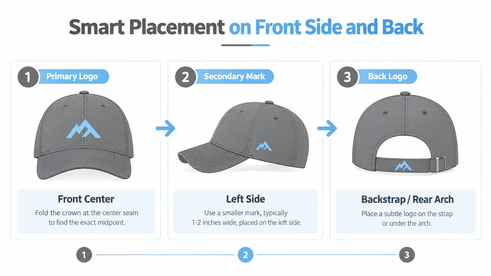
Fold the crown along the two front seams and mark the true centerline. Position the artwork on that axis, then measure from the crown seam to set its top and bottom boundaries. Leave enough clearance above the brim curve for the lower edge to remain visible when the hat is worn.
Structured, mid-profile crowns provide a flatter working surface and can accommodate a taller mark. Low-profile and unstructured crowns slope inward, which usually calls for a smaller logo placed slightly higher. Review how structured and unstructured crowns differ before approving the placement, especially when the same artwork will be used across multiple cap profiles.
Side and rear applications
Keep a secondary left-side mark compact and centered on the side panel. Standard commercial embroidery placement charts commonly position side marks around 1.25 to 1.5 inches above the brim. Side logos are generally much smaller than front artwork, often around 1.5 to 2.5 inches wide, according to commercial hat-logo placement guidance.
Rear decoration needs tighter control. Keep artwork near the rear opening no wider than roughly 1.75 inches, and confirm that it will not cross the adjustable strap. Commercial guidance also places many back applications around 3 to 3.5 inches wide and about 1 inch tall, although the workable limit changes when the mark sits directly on the strap area rather than above the arch.
Check four failure points before production:
- Low front marks: The brim shadow hides the lower portion.
- Drifting centerlines: The logo follows a panel instead of the crown midpoint.
- Overloaded side panels: A front-size wordmark wraps around the crown.
- Strap collisions: Adjustment hardware covers part of the rear decoration.
Quiet branding is often a placement choice
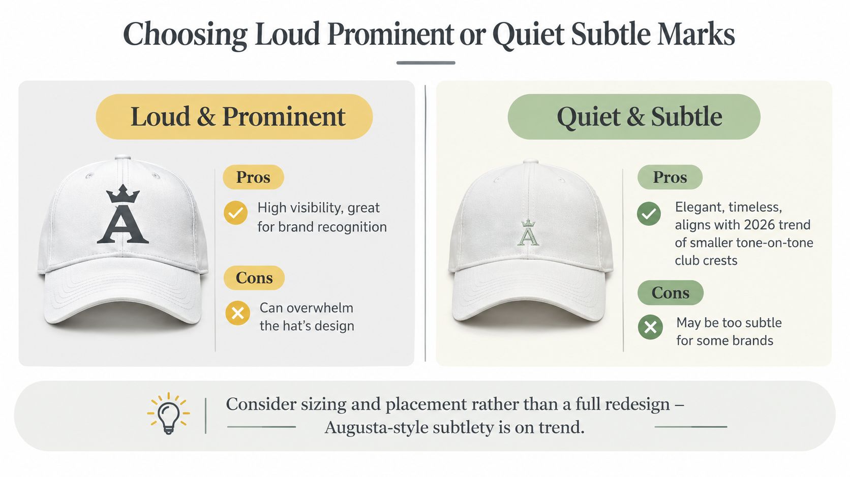
Independent coverage describes oversized and minimalist golf hats as trends for 2026, including small embroidered logos or no logo at major events such as Augusta National, as discussed by Plaid Gorilla Golf. That direction does not require changing the brand identity. It may mean reducing a broad front application or moving a secondary mark to a cleaner position.
A club crest often looks more refined with breathing room. A sponsor can preserve recognition through a clear front mark and restrained rear application instead of stacking graphics across the crown. The loud-versus-quiet choice therefore starts with size, placement, crown profile, and where the hat will be worn.
Choosing Loud Prominent or Quiet Subtle Marks
A logo decision starts at the sewing machine, not the mood board. Most front panels give you roughly a 4 to 5 inch usable field, and a dense embroidered mark can approach a 15,000 stitch budget before the crown puckers or the fabric loses its shape. Crown profile, seam position, and decoration method set the practical limits before brand preference enters the discussion.
That is why loud versus quiet is usually a sizing and placement choice. A large, high-contrast mark reads quickly across the course and suits pro-am merchandise or sponsor-heavy events. The trade-off is competition with the rope, sunglasses, sponsor patches, and clothing. Multicolor embroidery also adds density, thread changes, and more chances for distortion on a curved front.
A smaller mark can serve the same identity with less visual pressure. Tone-on-tone embroidery, a compact crest, or a side application fits clubhouses, commutes, and repeat wear. Printed marks can keep fine detail and broad color areas cleaner, while embroidery gives texture and a more tactile finish. The right choice depends on the artwork, crown fabric, and the distance at which the logo must read.
Choose by audience and setting
Use this filter:
- Member-only cap: Favor tonal embroidery, restrained contrast, and a mark that works beyond the course.
- Tournament or sponsor cap: Use brighter thread or print when recognition matters more than understatement.
- Pro-shop retail: Choose a finish that feels like a product rather than a giveaway. Leather, woven patches, and controlled embroidery can support that position.
- Performance cap: Reduce density and simplify the art so decoration does not overpower the lightweight crown.
A 2-inch crest may earn more repeat wear than a 4-inch block. A sponsor mark shrunk too far can look accidental instead of discreet. Quiet branding still needs enough scale, contrast, and separation from seams to remain intentional.
Approve the finished sample on the actual hat, not only on a flat proof. Check the logo from playing distance, inspect the crown for puckering, and confirm that thread colors hold under outdoor light. The complete fill-in-the-blank production brief appears in the final section, so keep this decision focused on audience, application, and the technical limits of the cap.
Vendor Brief Template and Final Quality Checks
A vendor brief prevents the most expensive kind of mistake, the one discovered after the full run. The decorator should know which hat they're using, how the logo must be applied, and what sample conditions require approval before production begins.
Fill every production field
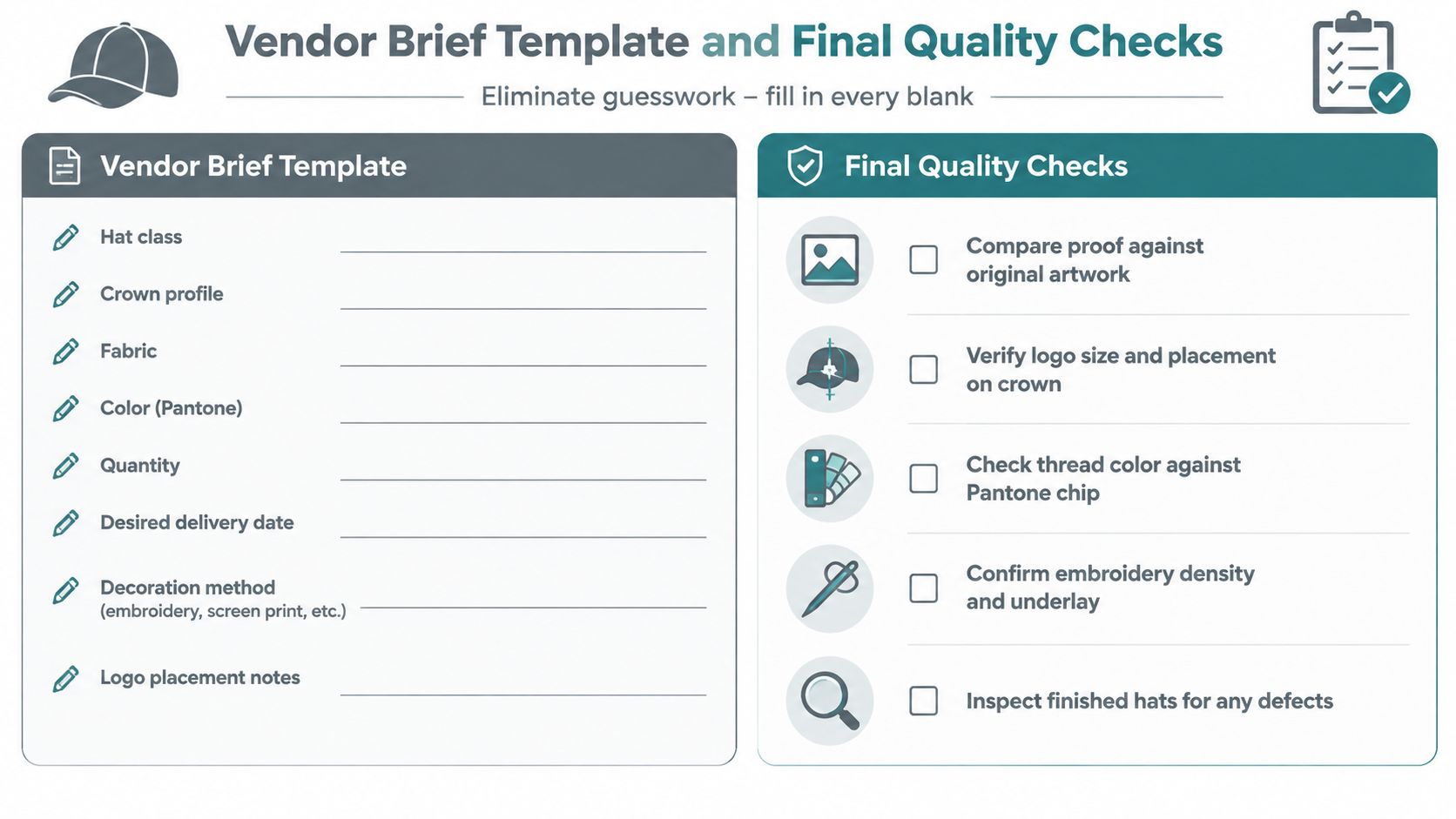
Give the vendor the hat class, crown profile, fabric, color, quantity, desired delivery date, and whether you need an overseas or domestic proof. Identify the decoration method, but invite the decorator to recommend an alternative if the artwork exceeds the front field or demands more stitch density than the fabric can support.
Include the logo's finished width and height, front or secondary placement, centerline reference, distance above the brim, thread or ink colors, estimated stitch count, and any acceptable Pantone variance. If the design includes a sponsor or event mark, identify which element has priority so the vendor knows what to preserve if simplification becomes necessary.
The broader principle appears in professional brand production work too. A Good Good Golf case study from Presidio is useful context for seeing how a golf identity can extend across branded applications. For a hat order, that means treating the cap as one controlled expression of the identity rather than sending a logo file without production instructions.
Request a sample before the run
Ask for one pre-production sample on the exact hat blank, not a different cap with a similar silhouette. Require a photo or scan of the sewn or printed sample, plus written confirmation of the finished dimensions and placement. Approve the sample only after checking it dry, on-head, and from normal conversational distance.
Use this production table as the written approval record:
| Brief Item | Approval Check |
|---|---|
| Hat class and crown profile | Confirm the sample uses the agreed blank and front-panel construction |
| Logo dimensions | Measure the finished mark, not the digital mockup |
| Placement | Check centerline, height above brim, side-panel alignment, and rear clearance |
| Decoration method | Verify embroidery, patch, or print matches the approved specification |
| Thread or ink colors | Compare against the agreed color references |
| Stitch count or density | Confirm the digitizer's estimate is appropriate for the fabric |
| Surface quality | Look for puckering, loops, loose threads, cracking, bleeding, or distortion |
| Legibility | Read the smallest lettering at ordinary viewing distance |
| Batch consistency | Compare finished hats against the approved sample before distribution |
Inspect the crown, not just the logo
A centered logo can still fail if thread tension pulls the panels inward. Check whether the crown remains smooth, whether the mark is horizontal, and whether the lower edge stays fully visible above the brim. Inspect embroidery for loose tails and uneven satin columns, and inspect print for registration shifts, ink cracking, and color bleeding.
For patches, check the edge bond, curl, and alignment. For rear decoration, confirm the strap hardware doesn't cover the mark. Record every requested change in writing before production, including revised dimensions and placement. Verbal approvals create ambiguity when the batch arrives.
Final decision: Choose the hat profile first, then select the decoration method, then size the artwork to the measured field. Your audience determines whether the mark should announce itself or whisper, but the crown geometry determines what will actually work.
2ndShotMVP offers golf hats, including fun designs and Flex Fit styles such as Birdie Boss and Golf & Tacos, for wear on and off the course. Visit 2ndShotMVP to compare available headwear and choose a cap whose profile gives your logo, or your personal golf style, the right production canvas.

